Sunday 14 April 2013

glasses

"Glasses"

For this illustration I wanted it to represent myself in some way, so I decided to add my pug Bella into the mix. The pug illustration itself is not mine, but I reproduced it from scratch and added my own twist to it. I feel the glasses make the image as funny as it is and I'm sure anyone that catches a glimpse of it will get a good kick out of it.

I started the illustration off by working on the background a bit, I wanted the background to have the same look as the main illustration so I made a solid green background while adding some blades of grass.

Screen Shot 2013-04-14 at 10.47.50 PM

I then added a layer by putting the base colour of the pug down from which i will work from.

Screen Shot 2013-04-14 at 10.48.05 PM

After laying down the base colour, I added the key features and other colours of the pug including the glasses I added to the illustration.

Screen Shot 2013-04-14 at 10.48.47 PM

I finished the pug illustration by adding the black outlines, wrinkles, fur, etc.

Screen Shot 2013-04-14 at 10.49.01 PM

To finish the illustration i added a blue sky with some clouds and a sun.

Screen Shot 2013-04-14 at 10.49.12 PM

Finished Illustration

Screen Shot 2013-04-14 at 10.54.12 PM

Friday 12 April 2013

whisper

Whisper

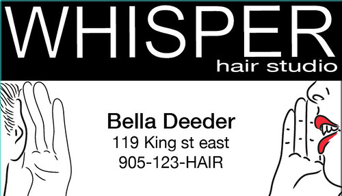
For my third post I illustrated a concept for "whisper". I thought hard about what I wanted to illustrate for this concept, I decided to create a business card for a hair studio. I wanted an 80's style look for the card.


I found references that I thought would fit best with the concept.

Screen Shot 2013-04-07 at 2.03.47 PM

Screen Shot 2013-04-07 at 2.05.06 PM

After finding images that fit best, I illustrated from the images to create vectors I would use for the business card starting with the whisper image.

Screen Shot 2013-04-07 at 2.05.23 PM

Then the listening vector.

Screen Shot 2013-04-07 at 2.04.17 PM

I positioned the 2 vector images into the business card layout.

Screen Shot 2013-04-07 at 2.14.44 PM

Continuing to build the layout I added a black box to hold the business name.

Screen Shot 2013-04-07 at 2.15.04 PM

I created a font I felt would best represent the look of an 80's hair studio, then positioned it inside the black background.

Screen Shot 2013-04-07 at 2.15.20 PM

Final information was added to the business card to finish the layout.

Screen Shot 2013-04-07 at 2.23.53 PM

Finished Product

Screen Shot 2013-04-07 at 2.26.40 PM

myth

Second post

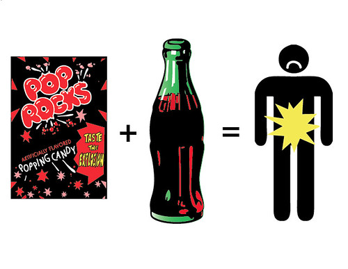
For my second post I decided to do an illustration for "myth". In keeping with my childhood and seeing how this myth as been around since then I decided to do the myth about the effects of pop rocks and cola.

I started by creating a black background for my pop rocks package.

Screen Shot 2013-04-07 at 3.57.42 PM

I then started putting in the red elements of the package.

Screen Shot 2013-04-07 at 3.57.50 PM

Some text and other elements added.

Screen Shot 2013-04-07 at 3.58.02 PM

Starting of the branding logo added to the package.

Screen Shot 2013-04-07 at 3.58.24 PM

The finished illustration of the Pop Rocks package.

Screen Shot 2013-04-07 at 3.58.33 PM


The second part of the illustration involved creating a vector cola bottle, I decided to illustrate a glass cola bottle since the myth dates back to when glass cola bottles were used, also because the glass cola bottle is more recognized.


First step was to create the background colour in which I would work from to create depth and contrast.

Screen Shot 2013-04-07 at 3.56.10 PM

Black was added to represent the cola and shadows in the image.

Screen Shot 2013-04-07 at 3.56.26 PM

Red was added for the low lights of the cola.

Screen Shot 2013-04-07 at 3.56.37 PM

White was added to highlight the bottle and give it dimension.

Screen Shot 2013-04-07 at 3.56.47 PM

I created a simple silhouette of a person>
Screen Shot 2013-04-07 at 4.04.03 PM

Then created a blast vector on his stomach and added a sad face.

Screen Shot 2013-04-07 at 4.04.15 PM

Finished image

Screen Shot 2013-04-07 at 4.07.49 PM


Monday 11 March 2013

ocean

This is my first project.

I'm converting a design I created for a movie poster into a book cover design. The springboard for this design project is the word "Ocean."

Step 1.

I took my design idea into Adobe Illustrator, I started my process by making vector silhouettes of the men in the poster design.

Screen Shot 2013-01-25 at 11.12.34 PM

Step 2.

After completing the silhouettes, I needed to add highlights and lowlights to the image so it didn't look flat.

Screen Shot 2013-01-25 at 11.12.50 PM

Step 3.

I felt i needed to add colour into the image, I decided to make the "11" stand out by colouring it a bright red.

Screen Shot 2013-01-25 at 11.13.02 PM

Step 4.

When looking for a book to put my illustration on, I wanted the old leather bound look, I just felt it would add character to the design.

Screen Shot 2013-01-25 at 10.48.11 PM

Step 5.

Once I found the book cover I loved and wanted to use I layered my design on the front cover of the book using different overlay techniques.

Screen Shot 2013-01-25 at 10.47.27 PM

Finished Design.

Screen Shot 2013-01-25 at 10.47.48 PM